Client
Project
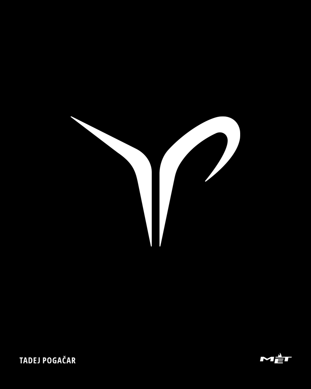
“Tadej Pogačar” Brand identity & Campaign
Thanks to:
1AC: Gabriele Segata @gabrieleciuchera
Color: Giulio Rosso Chioso @giuliorc.coloris
Sound design: Tommaso Simonetta @tommaso.simonetta
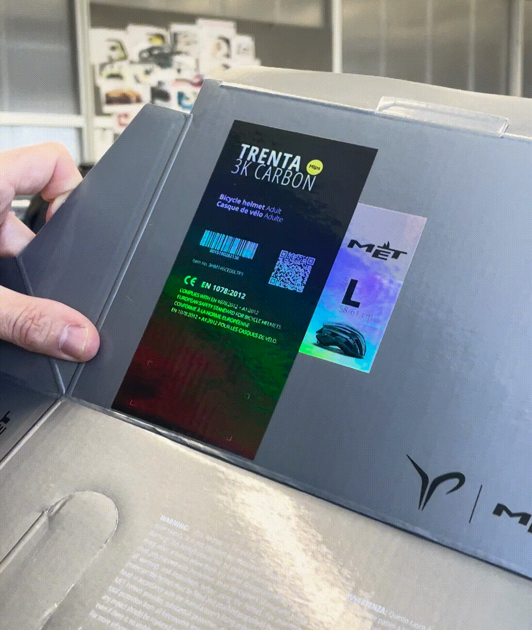
MET
@met_helmetsProject
“Tadej Pogačar” Brand identity & Campaign
@tadejpogacar
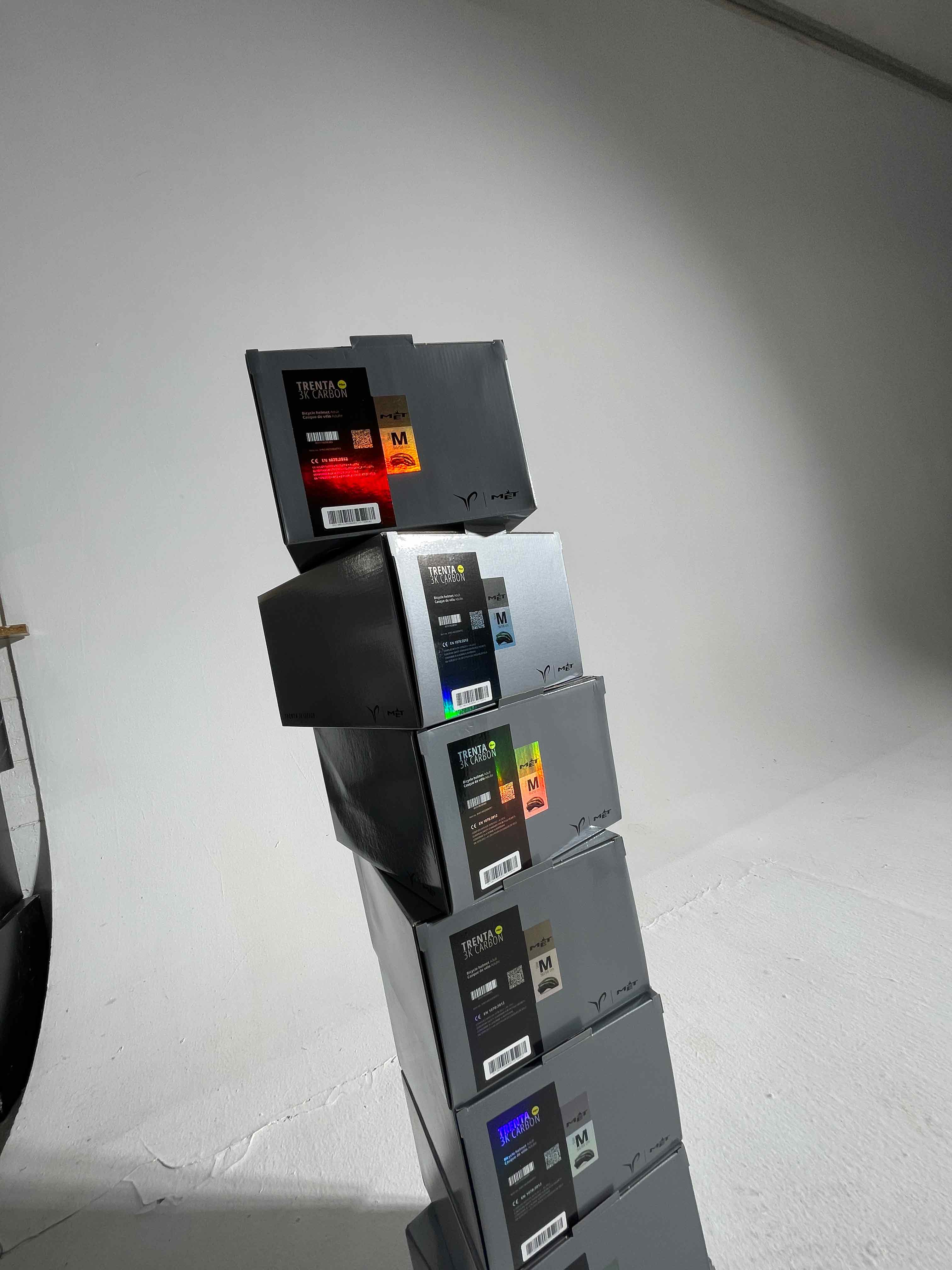
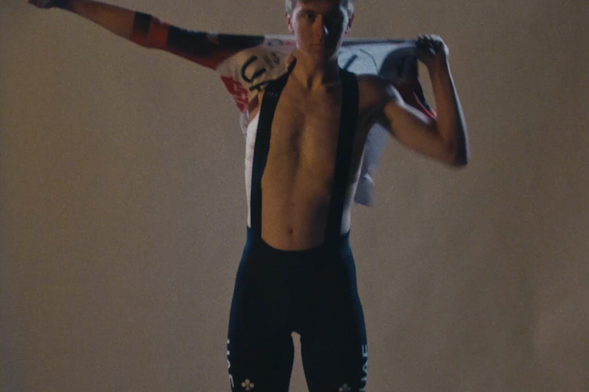
Together with the team at MET Helmets, in 2022 I have worked on the new brand identity for Tadej Pogačar, thus supporting his partnership with the brand. The official logo is the result of the naming and the monogram which is the central element for the athlete’s visual communication system. The name’s initials “T” and “P” are simplified with a nimble and dynamic shape identifying him and symbolically embodying his activities, achievements, goals and signature tufts. The primary typeface “Tadej Pogačar Regular” was designed and modeled on his handwriting. Later on the team has developed a new limited edition logo helmet and some merchandising together with the athlete. The MET Trenta 3K Carbon Mips® is a high-performance road helmet designed and destined for the most prolific and celebrated cyclists. It has been worn to Tour de France victory twice, seen multiple Grand Tour stage, Monument and one-day wins, and led races on all terrains from the imposing Hajar Mountains to Italy’s white roads, Flandrian cobbles all the way to Pyrenean summits. Next chapter with Tadej Pogačar starts now!
Thanks to:
3D artist (video): Match Studio @match.studio_
3D artist (logo): Davide Rubini @fhelpa
Motion design: Alessandro Maffioletti @alessandro_maffioletti
Photo courtesy: Ulysse Daessle @ulyssedaessle
Director: Tommaso Tagliaferri @tom.tagliaferri
DOP: Francesco Rosiglioni @francescorosiglioni1AC: Gabriele Segata @gabrieleciuchera
Color: Giulio Rosso Chioso @giuliorc.coloris
Sound design: Tommaso Simonetta @tommaso.simonetta


Client
TEDxBellano 2025
Project
“Salto nel vuoto” Visual identity
TEDxBellano 2025
@tedxbellano
Project
“Salto nel vuoto” Visual identity
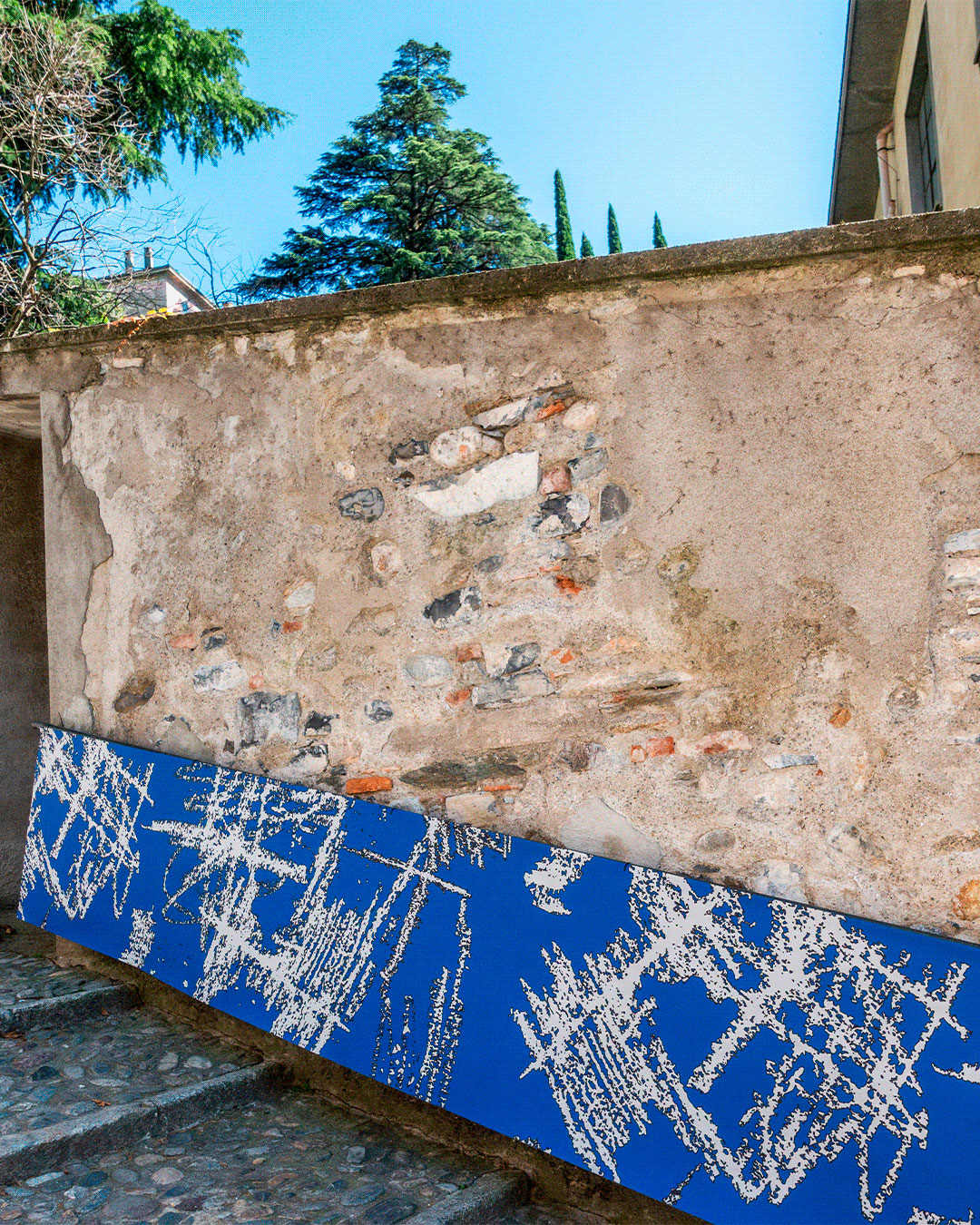
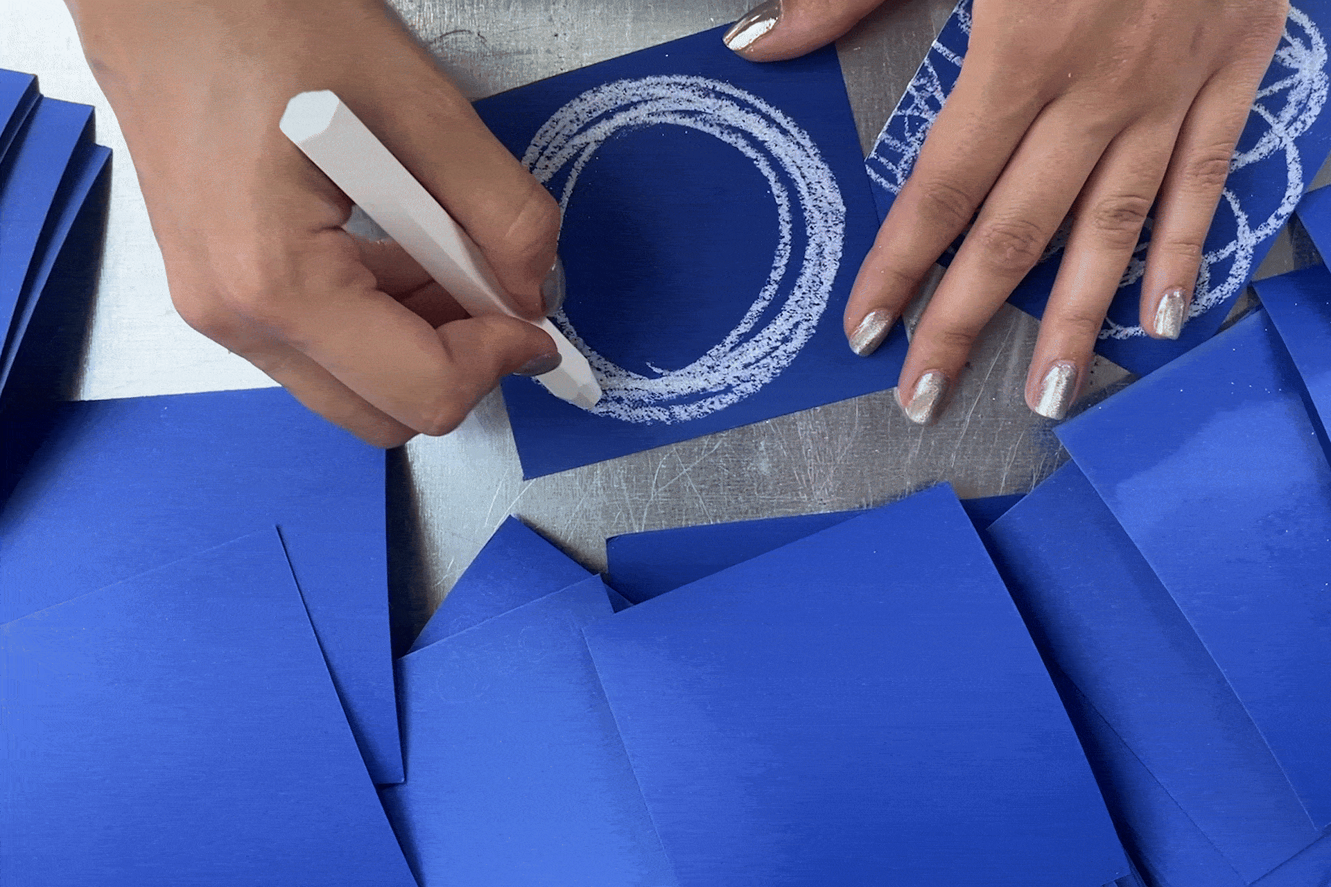
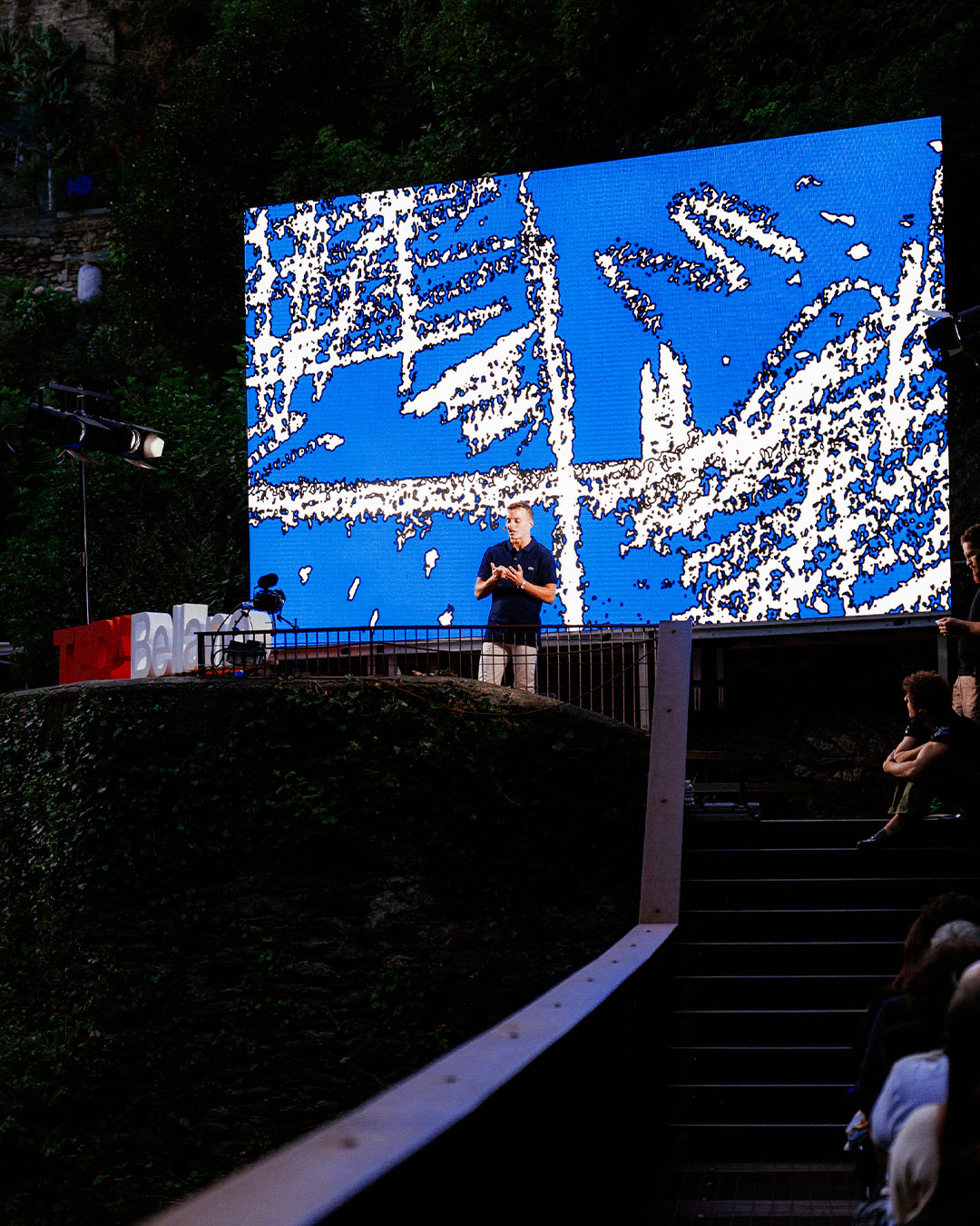
The theme for this year edition draws inspiration from the remarkable location:
the Orrido di Bellano. This deep and narrow canyon, shaped by centuries of natural forces, invites contemplation on what it means to take a leap — to embrace uncertainty, risk change, and open oneself to a new beginning.
A leap into the void is both physical and symbolic. It is a gesture driven by instinct, much like the spontaneous marks of a scribble on a blank page — a raw, immediate expression of intention and transformation.
A final note:
Our closing speaker, Davide Baraldi — an Italian athlete racing the Red Bull Cliff Diving and the Word Aquatics World Championships — was originally meant to conclude the event with a dive into the Orrido itself.
Unfortunately, due to low water levels at the time, the dive could not take place.
Visual identity designed with: Mirta Montanelli @mirtamontanelli
Motion graphic: Alessandro Maffioletti @alessandro_maffioletti
Thanks to the whole team.


Client
Arianna Ablondi Pedretti
Project
Brand identity
Arianna Ablondi Pedretti
@missablondi
Project
Brand identity
When Arianna called me for the first time in 2020 she asked me to help develop a visual image, identity and new logo for her clothing brand. I got to know her principles, her amazing manifesto and collections better day by day. I got a lot of information out of our conversations fairly quickly, but one fact stuck out more than the others: she is a born rebel and wants her brand to communicate the same through a specific, bold aesthetic. That’s why we started with a pictogram that represents her vision and her style. Resulting in nothing better than a butt and a heart. I drew the inspiration mostly from one of the pieces of last year’s collection.
The typeface used for the naming is Grillitype Alpina, meanwhile the secondary typeface is a custom hand made one, made directly by Arianna. Then we worked on business cards, stickers and other material. We worked together for almost a year between Lake Como, London and meetings in Milan and, in 2023, she presented her collection in London.


Client
Benedetta Gori @sbits
Project
“Towards New Food Futures” Visual identity.
Benedetta Gori @sbits
Ethnobotanist | Conservationist
National Geographic Explorer @insidenatgeo
Project
“Towards New Food Futures” Visual identity.
What if the future of food was not growing in fields, but waiting, wild, on sea-facing cliffs, white sandy dunes, or hiding in the deepest forests? The plants we eat today were once wild. In the Mediterranean, one of the historical cradles of agriculture, humans have, for millennia, identified, gathered and gradually domesticated the most promising species, shaping landscapes and food cultures alike.
But what if we could do it again?
Supported by @insidenatgeo @natgeo
Presented at @altrovemilano
A big thank to @sbits and @rachele.daminelli for asking me to design the visual identity for this project. It has been an honor to contribute.
Pictures: Tommaso Tagliaferri @tom.tagliaferri and Daniele De Carolis


Client
Project
“REVO” Brand identity & Campaign
MET Helmets
@met_helmetsProject
“REVO” Brand identity & Campaign
I’ve been asked to design the new brand identity for this new helmet, so I started looking into the main design feature, taking inspiration and transforming the graphic element into an "R". From there I developed the soft bag, product label, event signage and campaign. The all-new Revo MTB helmet is meticulously crafted to elevate safety standards beyond its predecessor. Through extensive research on both rotational and linear impacts, this helmet is designed to provide unparalleled protection. Its innovative design also enhances ventilation channels to ensure maximum comfort and airflow without compromising safety.
Photo courtesy: Ulysse Daessle @ulyssedaessle
Client
Project
“THE PØRNØGRAPHƏR” Visual identity
Hariel
Project
“THE PØRNØGRAPHƏR” Visual identity
A video call and three men struggling to understand each other. A glance from above or elsewhere and a computer that seems to transform into the Tower of Babel. A journey into the rotten flesh of images, toward knowledge of their creator, toward the discovery of something intimate about ourselves in a place where bodies appear for what they are. And then him.
THE PØRNØGRAPHƏR, the first AI film in the history of the Venice Film Festival to be selected in the competition of an officially recognized competitive section, is presented in competition at the 40th edition of the @settimanadellacritica, a section of the 82nd Venice Film Festival @labiennale.
Bringing moving images produced with AI today signifies an important legitimacy: placing algorithmic cinema on the same level as live-action and traditional animation, without any distinction.
Thanks to:
A movie by HARIEL
AI artist: Flavio Pizzorno
Screenplay: Pietro Lafiandra
Editing: Andrea Rossini
Colorist: Andrea Sanna
Voice #2: Jacopo Adolini
Voice #3: Gianpaolo Caloyera
Music by Andrea Rossini & LIMONOV
3D Artist: Irene Cavazzoni Pederzini
Creative direction & Title design: SamSalaStudio
Graphic design: Irene Guastalla


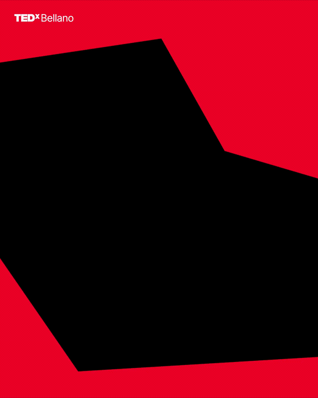
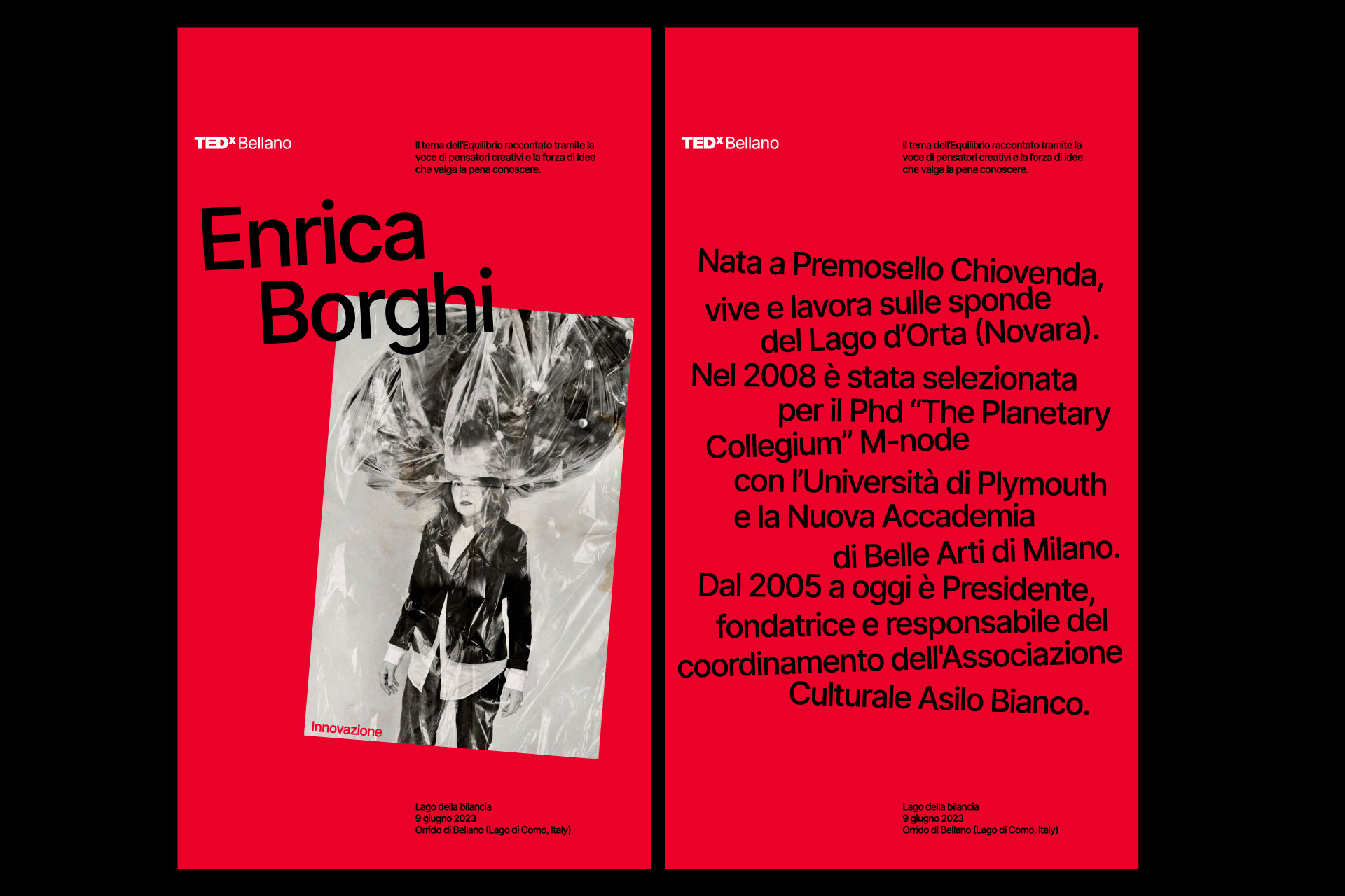
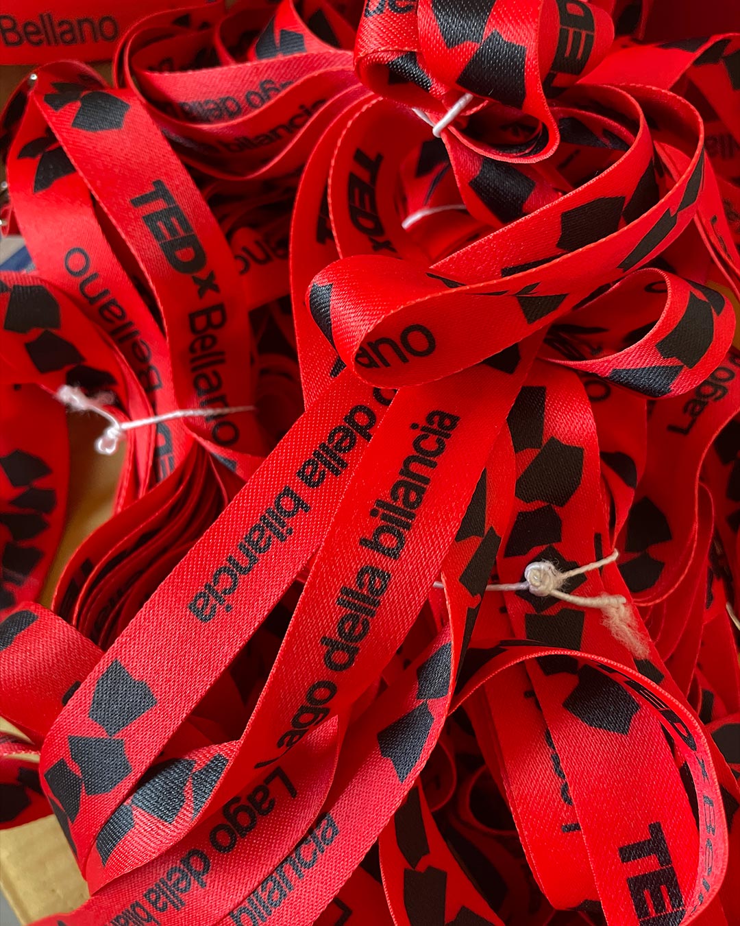
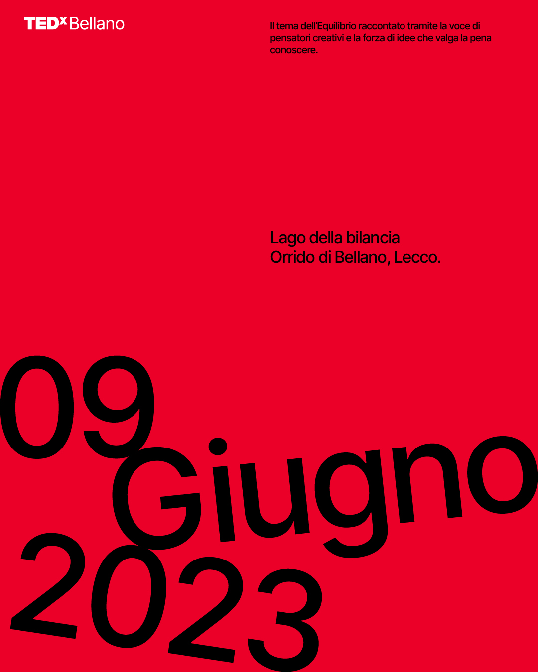
Client
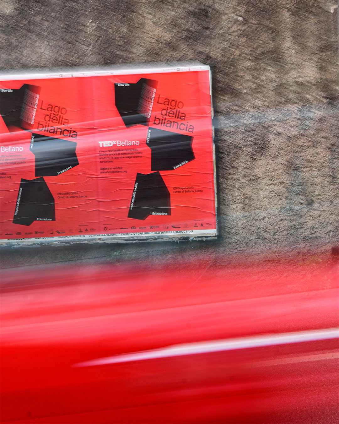
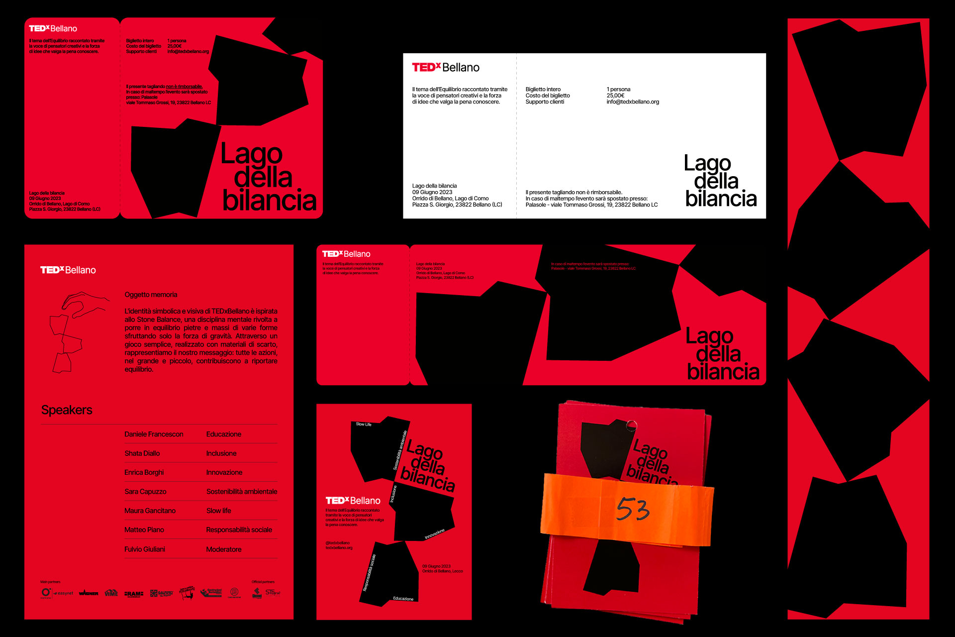
TEDxBellano 2023
Project
“Lago della bilancia” Visual identity
TEDxBellano 2023
@tedxbellano
Project
“Lago della bilancia” Visual identity
In the spirit of ideas worth spreading, TEDx is a program of local, self-organized events that bring people together to share a TED-like experience. At a TEDx event, talks video and live speakers combine to spark deep discussion and connection. These local, self-organized events are branded TEDx, where x = independently organized TED event. The conference provides general guidance for the TEDx program, but individual events are self-organized.
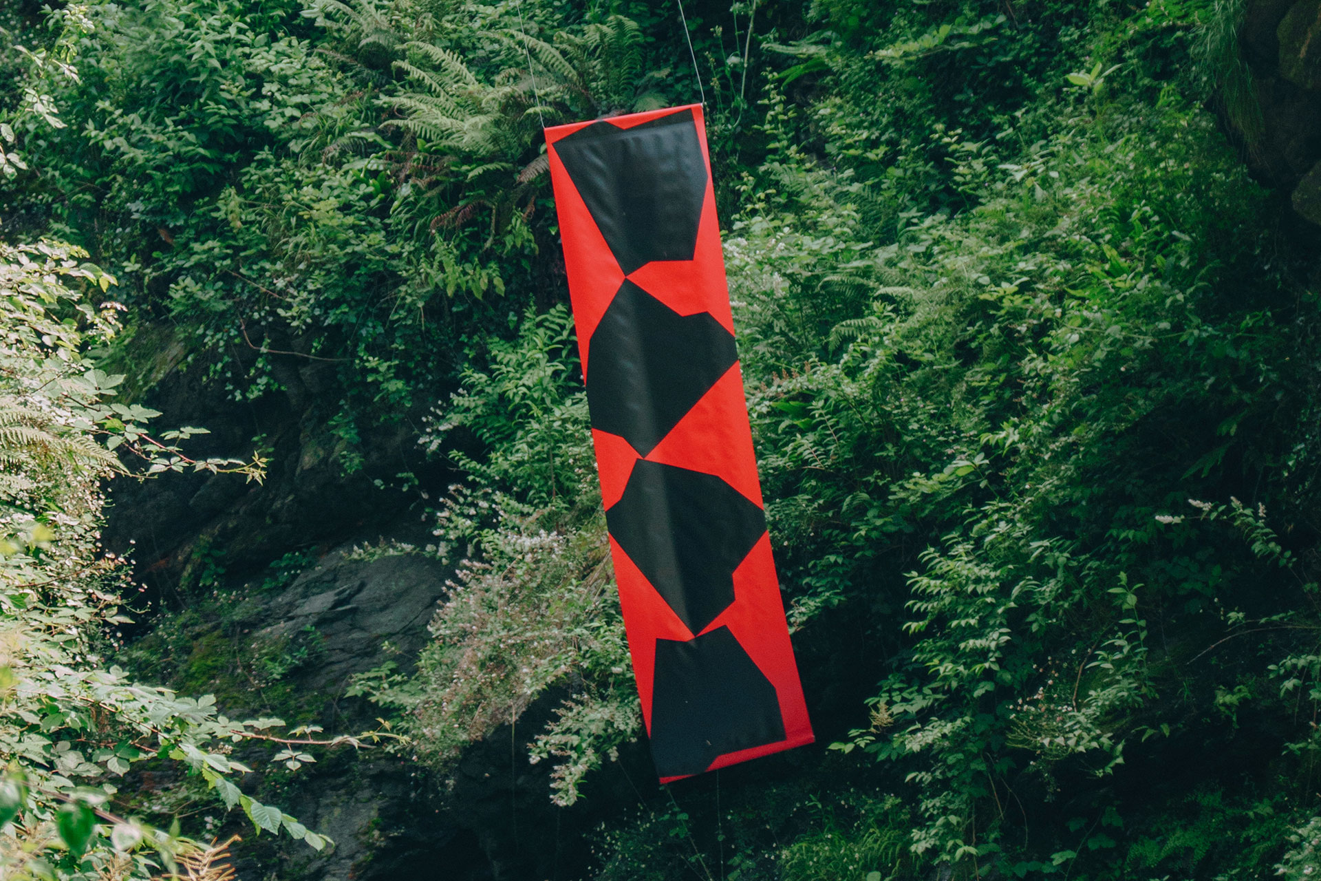
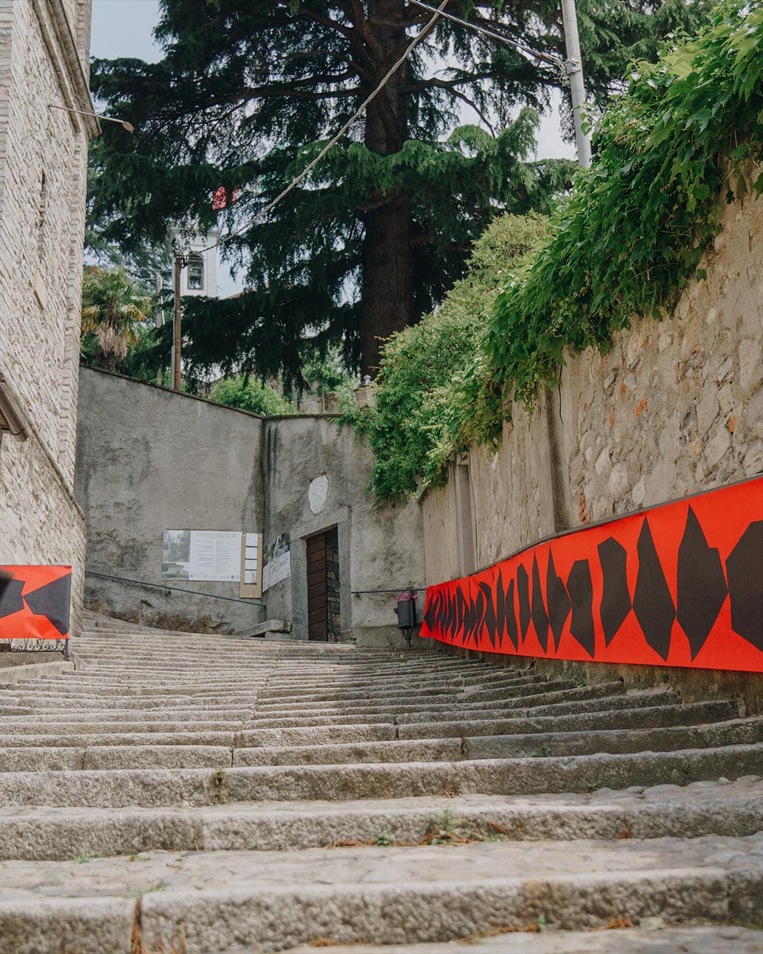
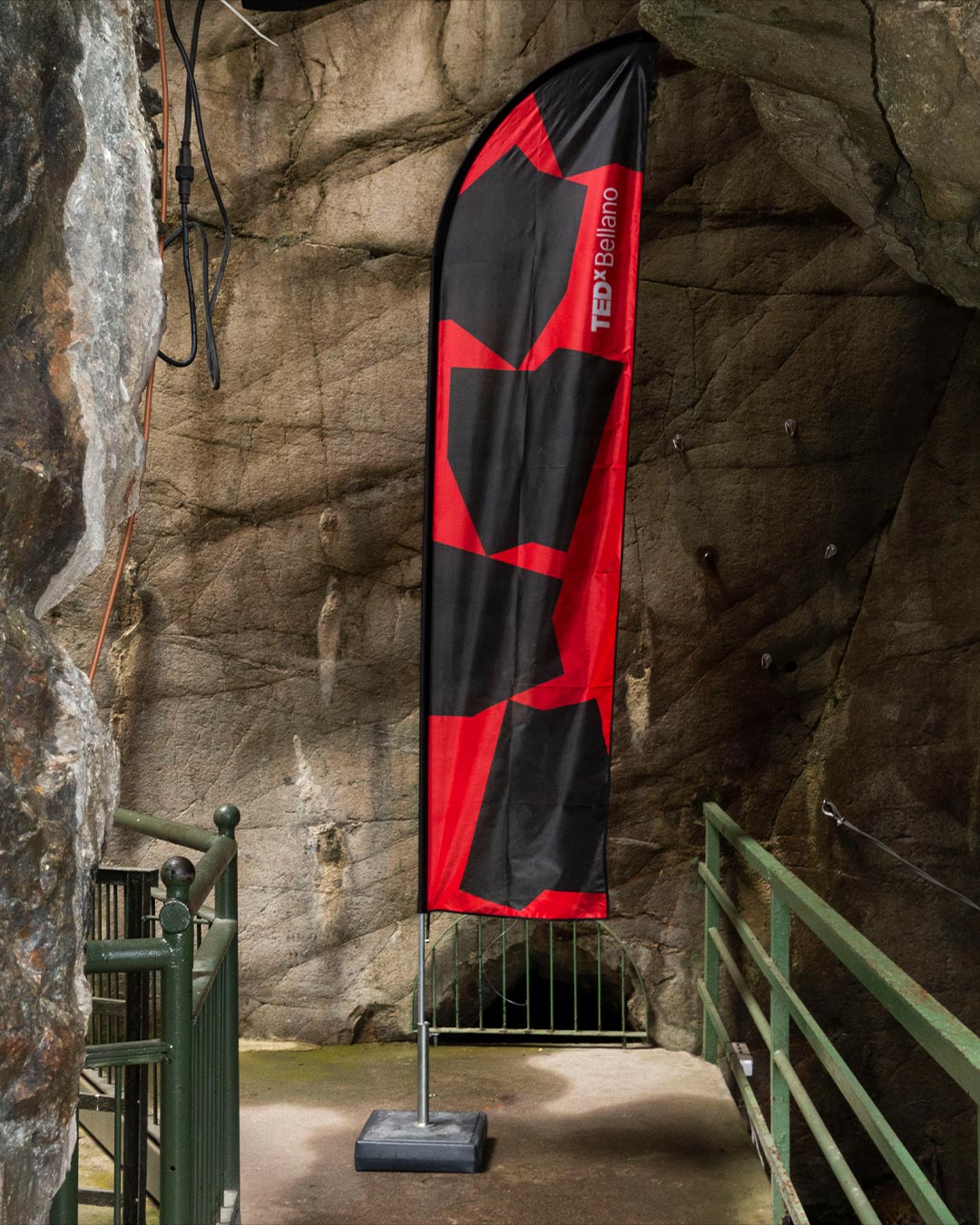
Together with an incredible team I had the opportunity to be part of the organisation and design the visual identity of the TEDxBellano, which took place inside the Orrido di Bellano, a waterfall located in a gorge in the municipality of Bellano (LC). The natural gorge was formed 15 million years ago, due to the erosion of the waters of the Pioverna torrent, which carved an ever narrower and deeper furrow from Taceno to the Lario. Nowadays it can be visited thanks to a footbridge anchored to the rock walls that runs through the entire gorge equipped with lighting. The symbolic and visual identity of TEDxBellano is inspired by Stone Balance, a mental discipline aimed at balancing stones and boulders of various shapes using only the force of gravity. Working with the guidelines provided by the TED brand, I designed an image that is identifiable and, at the same time, coherent with the location and the themes dealt by the speakers. Finally, through a simple game, made with discarded materials, we represent our message: all actions, in big and small, contribute to restore balance.
Thanks to:
Erind Guri, Achille Montanelli, Andrea Taddeo, Andrea Trussoni, Antonio Rusconi, Aurore Dudka, Chiara Rusconi, Marco Denti, Stefania Ferrari, Stefano Calvasina, Stefano Usai, Valentina Rigoli, Middle Collective


Client
Project
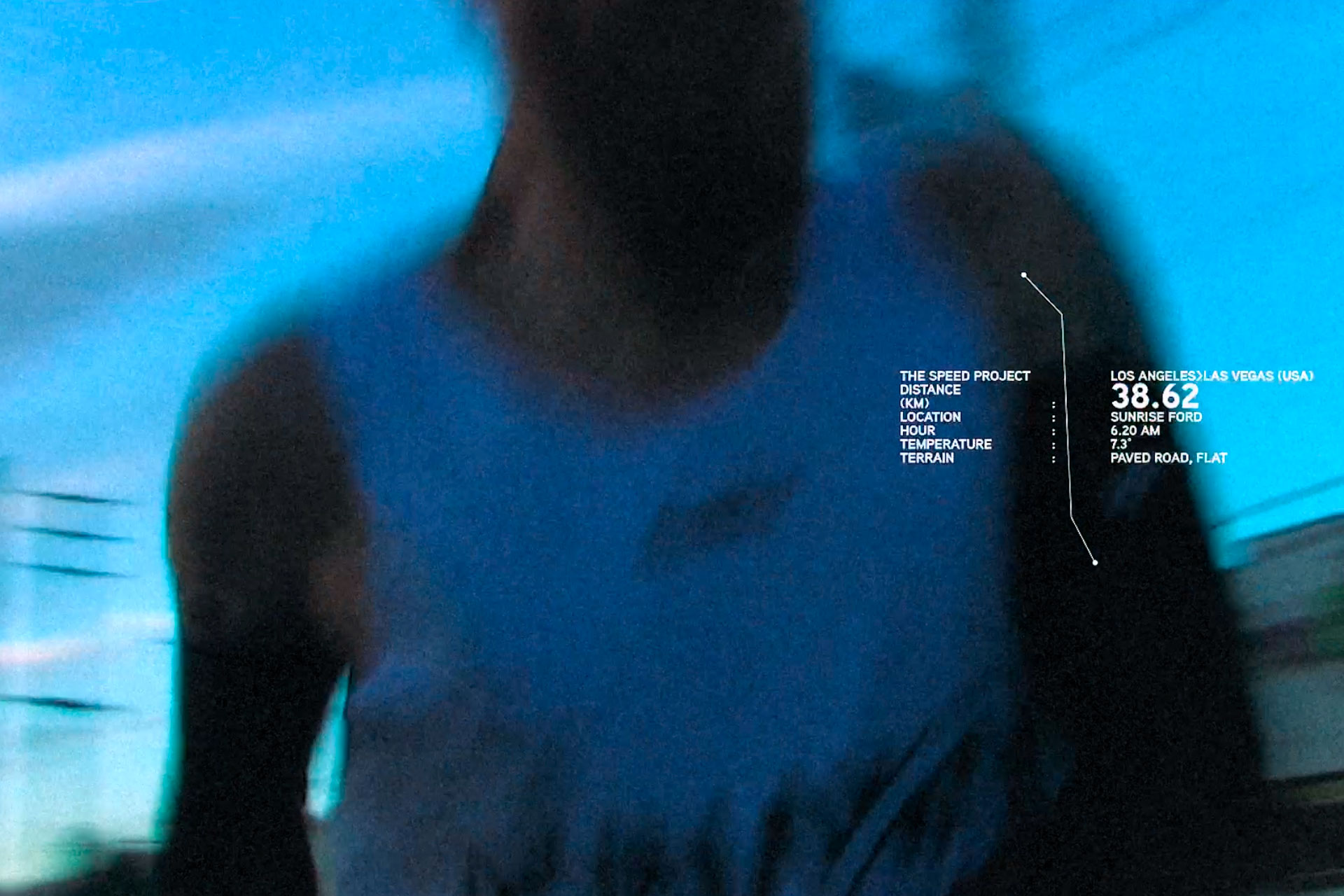
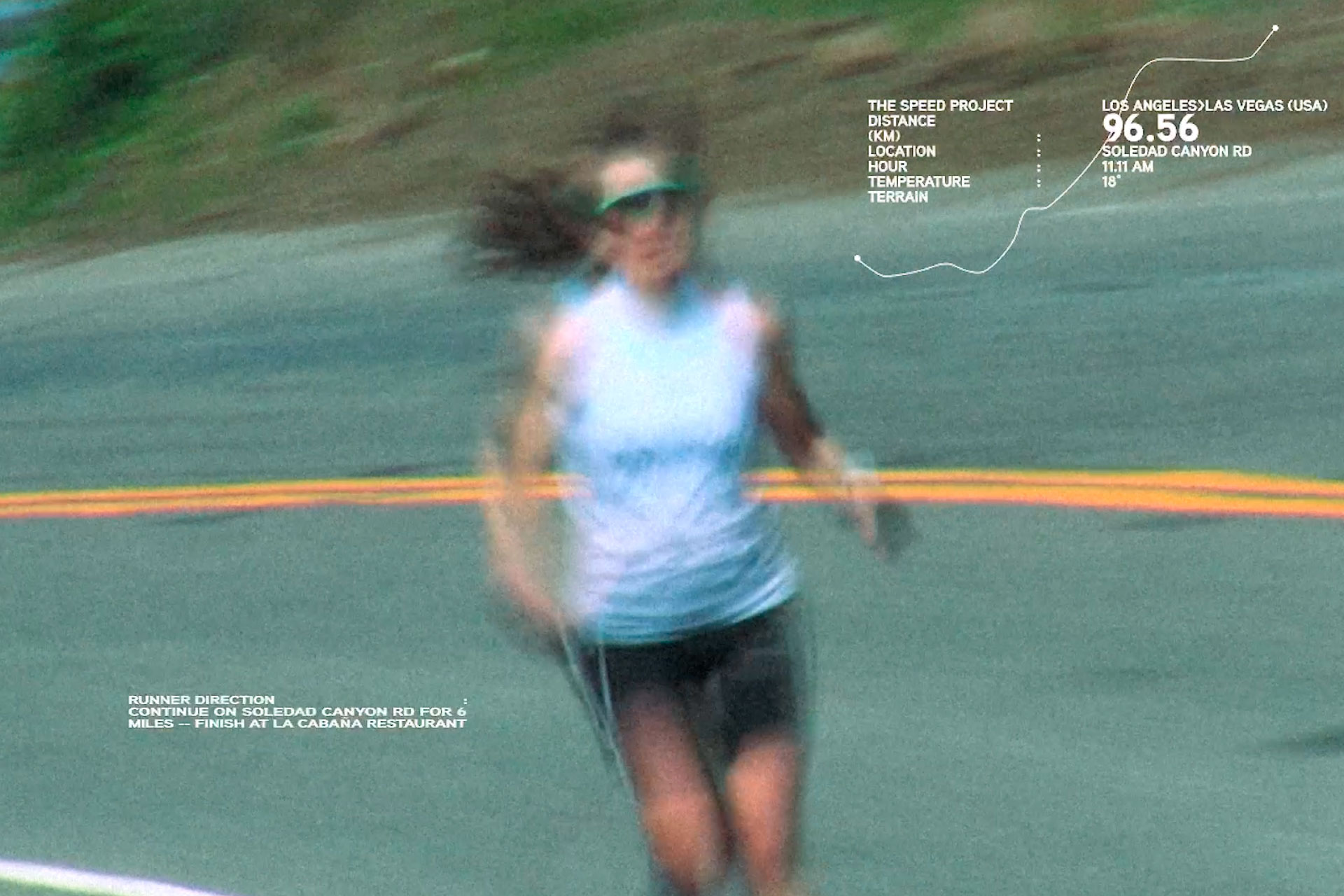
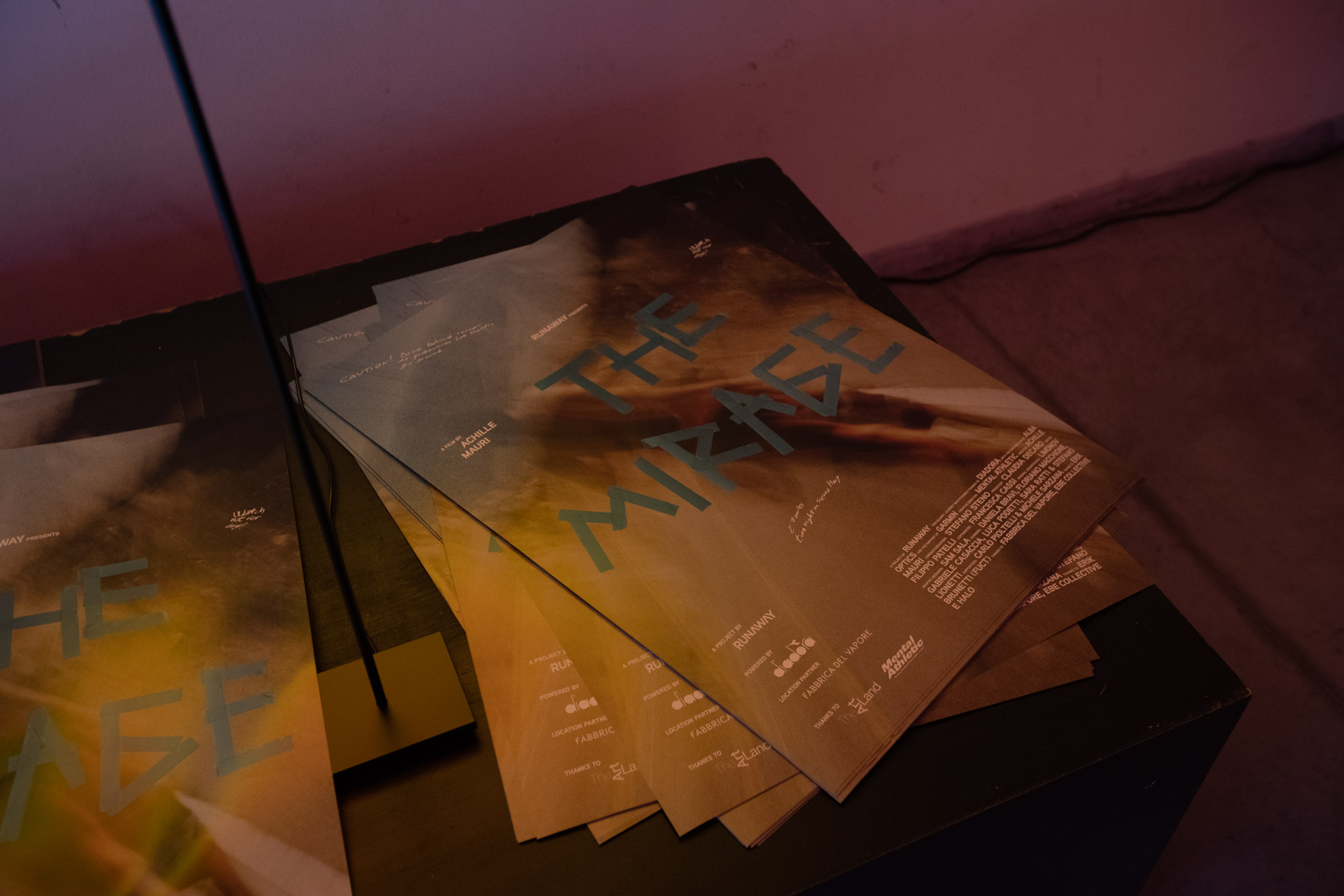
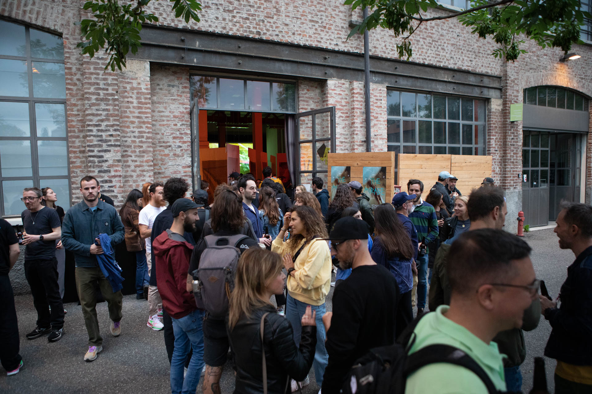
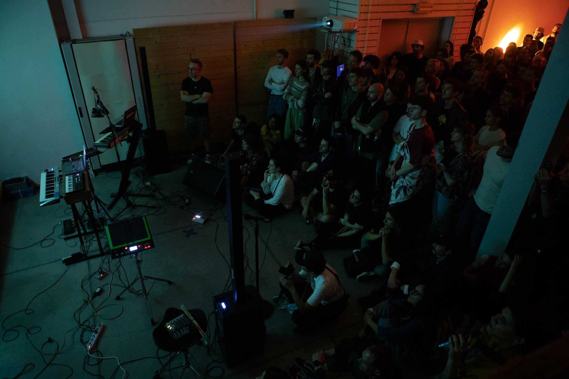
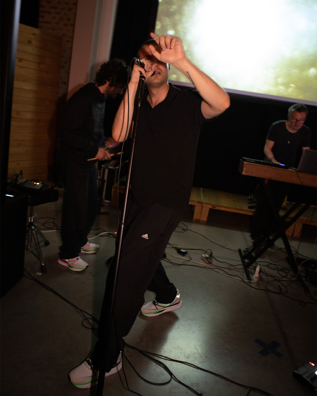
“The Mirage” documentary
Runaway & Diadora
@runawaymilano @diadoraProject
“The Mirage” documentary
(Experimental Award at ONA Short Film Festival in Venice 2023)
Visual identity
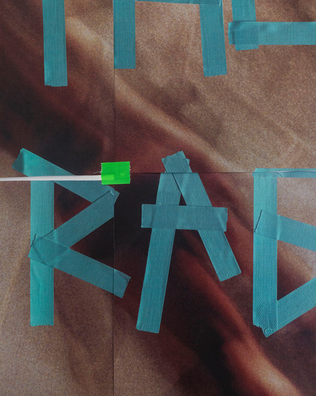
In the heart of a relentless desert, where the scorching sun hugs the endless horizon and the day surrenders to darkness, a mystical journey begins. A 548-kilometre odyssey from Santa Monica to Las Vegas that transcends all rules, defies all expectations and surpasses the boundaries of the possible. A select few runners, no spectators: a challenge for only those with the courage to push their limits. Starting from the /mi-rage/ concept, an optical phenomenon that can trick the mind into perceiving something that appears to be near, but is actually far away, or non-existent, I had the pleasure to design the visual identity of the documentary using a hand-made typography for the main title (assembling it with runner tape) and all the collaterals: the official poster, social media contents, graphic super for the documentary and end titles.
*Fun fact: together with my band, LIMONOV, we have written the sound tracks, playing a live set before the projection in Milan.
Thanks to:
Garmin & Alba Optics
Creative director: Mental Athletic @mental.athletic
Director: Achille Mauri @achillemauri.eu
DOP: Stefano Steno @stefanosteno
Creative producer: Claudia Decaro @claudia_decaro
Editor: Filippo Patelli @fil.dalfuturo
Copyrighter and VO: Francesca Cassi @ffringe
Original music: Limonov @limonov.band
Runners: Floriano Macchione, Gabriele Casaccia, Daniela Bravi, Luca Podetti, Sara Ratti, Stefano Lionetti.
Supporters: Carlo Pioltelli, Michele Sarzana
Extra thanks to:
Erik Brunetti (FUCT), Fabbrica del Vapore Milano, Ebe Collective, Halo Edition


Client
Project
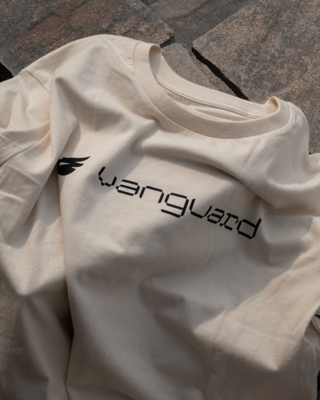
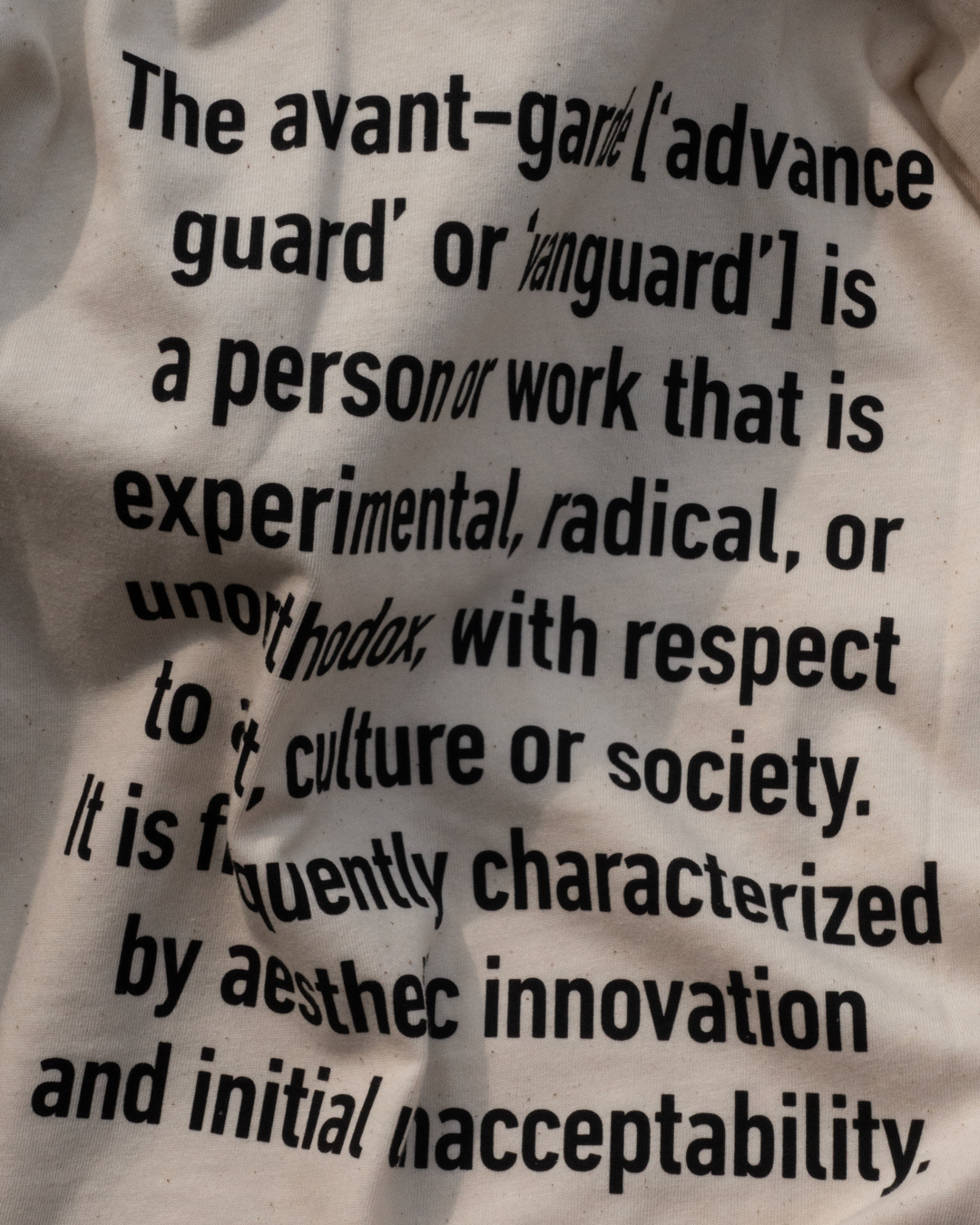
“Vanguard” Brand identity & Campaign
Bluegrass
@bluegrass_eagleProject
“Vanguard” Brand identity & Campaign
Designed from the ground up, the Bluegrass Vanguard Core is a lightweight full-face helmet for committed MTB riders. As well as being downhill ASTM F1952 and e-bike NTA 8776 certified, the Vanguard Core includes Mips brain protection and was rated five stars at the Virginia Tech Helmet Lab. The Vanguard Core leads from the front, keeping your head as safe as possible while you shred the trails. Together with the team at Bluegrass I had the opportunity to work on the Vanguard visual identity. Based on a custom tech typeface, I designed all the outputs the product needed. From digital contents to packaging, tags and visual assets.
Thanks to:
Logotype design: Riccardo Riggio @riccardoriggio
Motion graphic: Alessandro Maffioletti @alessandro_maffioletti
Photo courtesy: Ulysse Daessle @ulyssedaessle


Client
Project
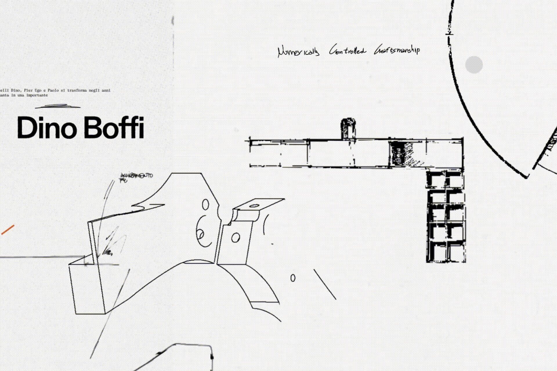
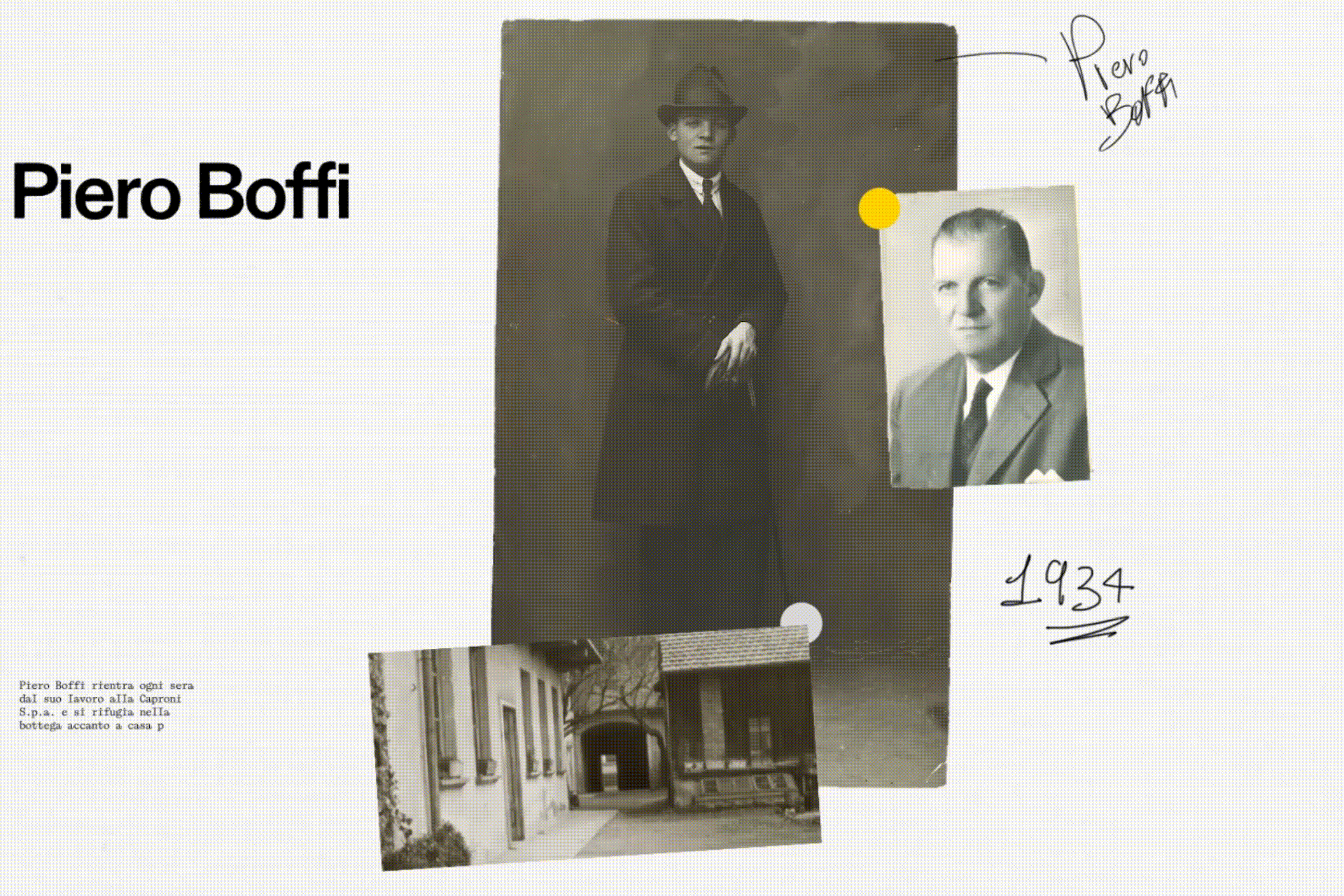
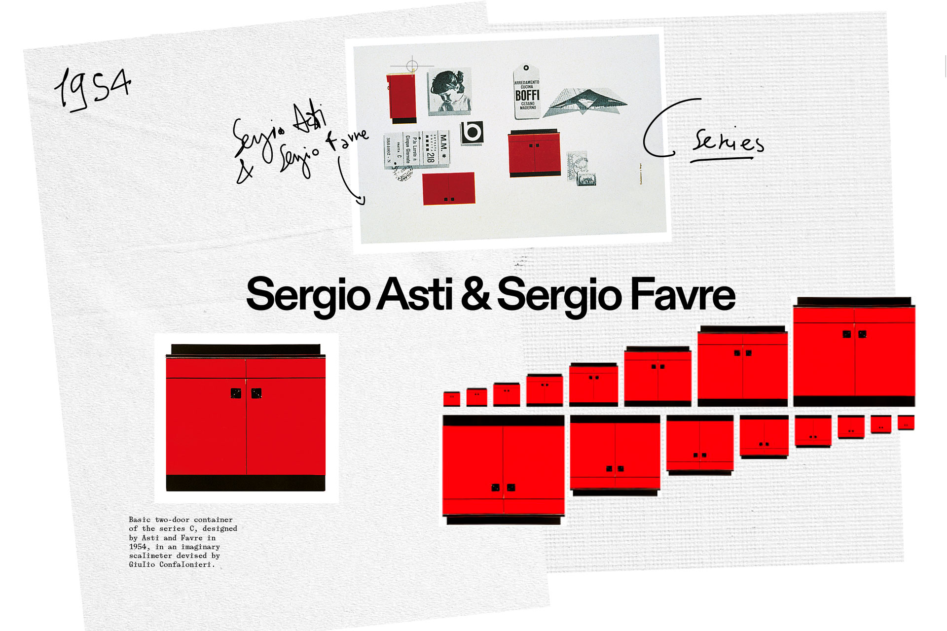
Historic video for the Boffi | DePadova 90th anniversary
For the company anniversary, ZEP Studio asked me to design the entire identity
for the institutional video, to celebrate the milestone during the Milan Design Week 2024. I had to dig a lot in their archives to find the right material that best represented the key points of this long last story. Based on a certain timeline, my role was to visually represent the stages of the brand over these years.
Thanks to:
ZEP Studio x Boffi | DePadova
@zepstudio @boffidepadova_officialProject
Historic video for the Boffi | DePadova 90th anniversary
For the company anniversary, ZEP Studio asked me to design the entire identity for the institutional video, to celebrate the milestone during the Milan Design Week 2024. I had to dig a lot in their archives to find the right material that best represented the key points of this long last story. Based on a certain timeline, my role was to visually represent the stages of the brand over these years.
Thanks to:
Creative Direction: ZEP Studio @zepstudio
Production: ZEP Studio @zepstudio
Motion graphic: Alessandro Maffioletti @alessandro_maffioletti


Client
Enough Cycling Collective
@enough_cycling
Project
Visual identity season 2023
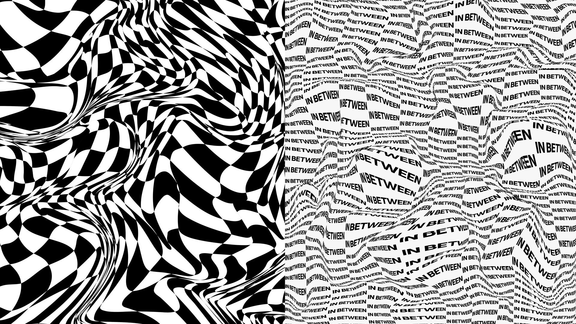
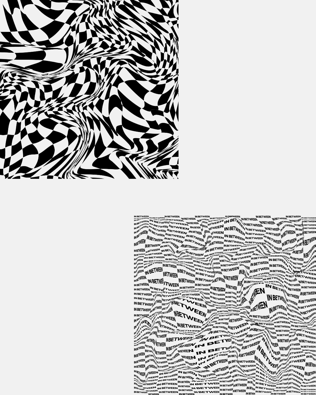
Enough is a cycling collective born from a pretty simple idea: a bike is enough to be happy! They started the journey in 2021 with a group of eight cyclists, participating – and sometimes winning – in major events and races around the world. They like to have fun and tell stories with a fresh and simple angle. In December 2022, I was contacted by Federico, founder of Enough Cycling Collective, who asked me if I would be interested in collaborating with them to design the team’s visual image for the new year. With their philosophy in mind, I started working on the applications by designing the visual identity: colors, typography and layout. The payoff "Great things happen in between" is represented by a sans-serif typography combined with a script font that breaks the linearity. With the central asset given by Pas Normal Studios, I designed the official T-shirt and the water bottle. Here are the logo, the claim and two different cuts of the pattern for more dynamicity. Then I worked in parallel on a typographic treatment that would pick up the movement of the asset. To help the team communicate more massively, especially during different events, I designed 5 stickers that contain the logo, claim and a call to action to the official manifesto. Finally, I designed a visual format for social media communication. Starting from the official 2023 calendar, to the Instagram stories that were used during the events.
Thanks to:
Design asset: Pas Normal Studios @pasnormalstudios
Smile design: Anna Kollmann-Suhr @annakollmansuhr
Photo courtesy: Anna Kollmann-Suhr,
Lukas Piel, Chiara Redaschi
Enough Cycling Collective
@enough_cycling
Project
Visual identity season 2023
Enough is a cycling collective born from a pretty simple idea: a bike is enough to be happy! They started the journey in 2021 with a group of eight cyclists, participating – and sometimes winning – in major events and races around the world. They like to have fun and tell stories with a fresh and simple angle. In December 2022, I was contacted by Federico, founder of Enough Cycling Collective, who asked me if I would be interested in collaborating with them to design the team’s visual image for the new year. With their philosophy in mind, I started working on the applications by designing the visual identity: colors, typography and layout. The payoff "Great things happen in between" is represented by a sans-serif typography combined with a script font that breaks the linearity. With the central asset given by Pas Normal Studios, I designed the official T-shirt and the water bottle. Here are the logo, the claim and two different cuts of the pattern for more dynamicity. Then I worked in parallel on a typographic treatment that would pick up the movement of the asset. To help the team communicate more massively, especially during different events, I designed 5 stickers that contain the logo, claim and a call to action to the official manifesto. Finally, I designed a visual format for social media communication. Starting from the official 2023 calendar, to the Instagram stories that were used during the events.
Thanks to:
Design asset: Pas Normal Studios @pasnormalstudios
Smile design: Anna Kollmann-Suhr @annakollmansuhr
Photo courtesy: Anna Kollmann-Suhr,
Lukas Piel, Chiara Redaschi


Client
Essense Magazine
@essense_magazine
Project
Brand identity
Driven by a passion for gastronomy and the world around it, Essense Magazine seeks to shine a light on the people behind the scenes and show who they are, what they love, what they are driven by. Meanwhile, it tries to show everything related to gastronomy, from producers to lifestyle, from sport to travel. All driven by the senses and the heart. To look at the world of hospitality and everything that surrounds it with the desire to make people discover new places, young talents, new products and producers, and to discover who is behind the people who make gastronomy come alive. For this project I was asked to design: naming, brand identity and website. The image is minimal, clean but with meaning. From the naming to the entire visual identity, I wanted to express the union between the essence itself and the five senses. More in depth, the logo shows how the essence of a specific ingredient can elevate the perception of our senses. The union is visually represented by the customised double 'S', which becomes the official monogram.
Thanks to:
Web developer: Odon Airoldi


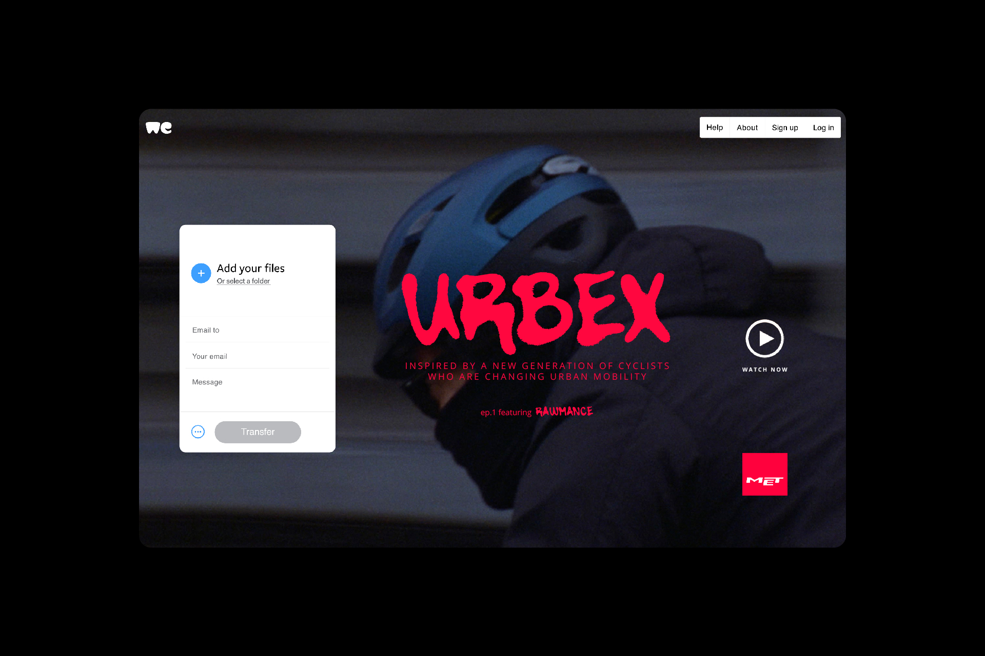
Client
MET Helmets
@met_helmets
Project
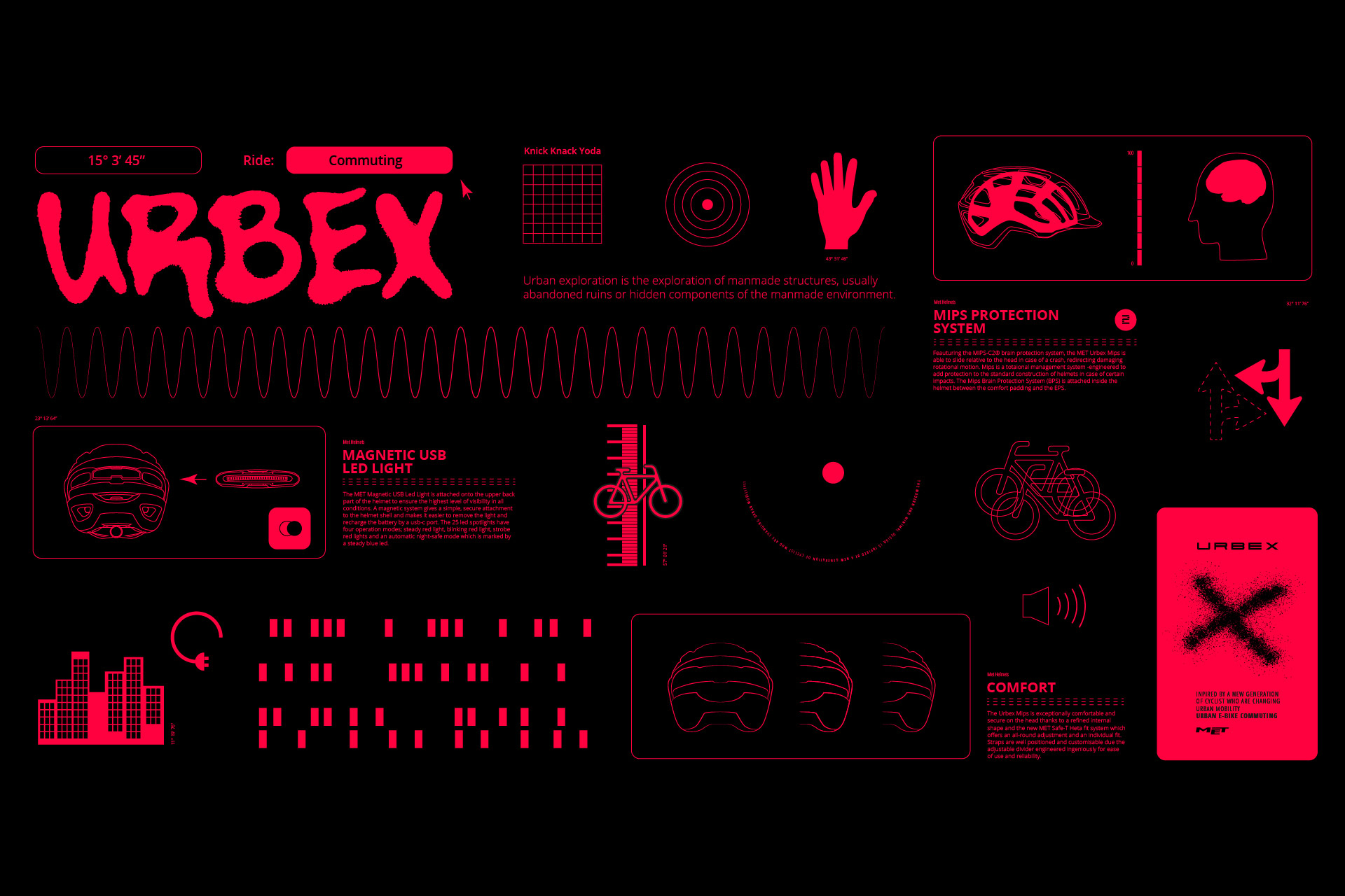
“Urbex” Brand identity & Campaign
Together with the MET Helmets team, I designed the visual identity and assets for the new Urbex campaign. The modern and minimal design of this new helmet is inspired by a new generation of cyclists who are changing urban mobility. Made safer by NTA certification, the Urbex is fully equipped with features that ensure comfort, visibility and ease of use. For the campaign we collaborated with Matéo Montero aka Rawance, French DJ and owner of a Rome-based record label, to hit a young and dynamic target. The whole identity wants to inspire and attract a new generation of cyclists, reminding them to always wear a helmet. I chose an identifying red color based on the rear lights of the cars, enhancing their movement.
Thanks to:
Director: Achille Mauri @achillemauri.eu
Cinematography: Stefano Steno @stefanosteno
Music by: Andrea La Pietra @_anddot
Sound designer: Tommaso Simonetta @tommaso.simonetta
Starring: Rawmance @rawmance707
Voice: Rawmance @rawmance707
MET Helmets
@met_helmets
Project
“Urbex” Brand identity & Campaign
Together with the MET Helmets team, I designed the visual identity and assets for the new Urbex campaign. The modern and minimal design of this new helmet is inspired by a new generation of cyclists who are changing urban mobility. Made safer by NTA certification, the Urbex is fully equipped with features that ensure comfort, visibility and ease of use. For the campaign we collaborated with Matéo Montero aka Rawance, French DJ and owner of a Rome-based record label, to hit a young and dynamic target. The whole identity wants to inspire and attract a new generation of cyclists, reminding them to always wear a helmet. I chose an identifying red color based on the rear lights of the cars, enhancing their movement.
Thanks to:
Director: Achille Mauri @achillemauri.eu
Cinematography: Stefano Steno @stefanosteno
Music by: Andrea La Pietra @_anddot
Sound designer: Tommaso Simonetta @tommaso.simonetta
Starring: Rawmance @rawmance707
Voice: Rawmance @rawmance707


Client
Studio Fotografico Lops
@studiofotograficolops
Project
Rebranding
Since 1986 Studio Fotografico Lops has been translating the character of people into images and telling their stories. As early as the 1980s, Giuseppe Lops was among the first to favor a more spontaneous style and the use of natural light, bringing reportage into the field of wedding photography. This allowed the studio to become one of the landmarks of Milanese photography and beyond. Forty years later his son Domenico, with a broader photographic background, carries on the work begun by Giuseppe, following the canons of photojournalism and portraiture and expanding the services offered by the studio. In 2021, to enhance this generational change, I was commissioned to completely restyle the studio. After analyzing the studio's archival materials and talking with Domenico Lops about its philosophy and working method, I identified two key words: images and people. The pictogram was born from the union of these two concepts, and if in a story the brackets enclose a specific moment, Studio Fotografico Lops through this symbol imprints in images the special moments of people. The pictogram was designed with possible digital and animated developments in mind. Thanks to the inktraps in the vertices, the movement will be more dynamic. The first materials produced were business cards, printed on Fedrigoni 300g paper with embossing of the logo. Thanks to the dynamic format of the pictogram, the most important information can be placed within it, thus making the communication more identifying. To meet the needs of the firm, a letterhead was designed and then adapted to two different documents: contract and price list. Next, I designed envelopes, creased photo folders, stickers and canvas bags. In order to make the new identity recognizable, I designed the firm's signs conforming them to the new communication rules and, thanks to the double window, I decided to position the logo exploiting all its horizontality. Finally, I unified the studio's digital presence by designing a new website. The goal was to create a fresh, contemporary tool that encapsulates the studio's best work while also enhancing its historicity.
Thanks to:
Concept, art direction e brand design: SamSalaStudio e Riccardo Riggio
Copywriting: Alessandro Vanossi
Web development: Odon Airoldi
Printing company: Prograf


Client
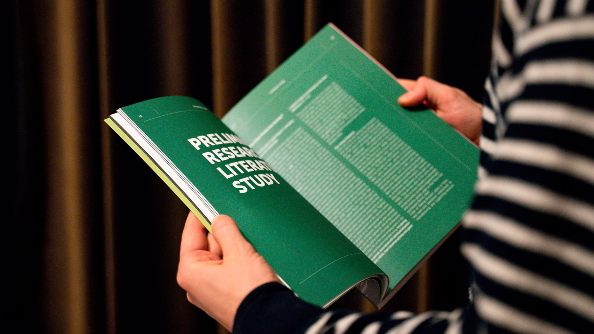
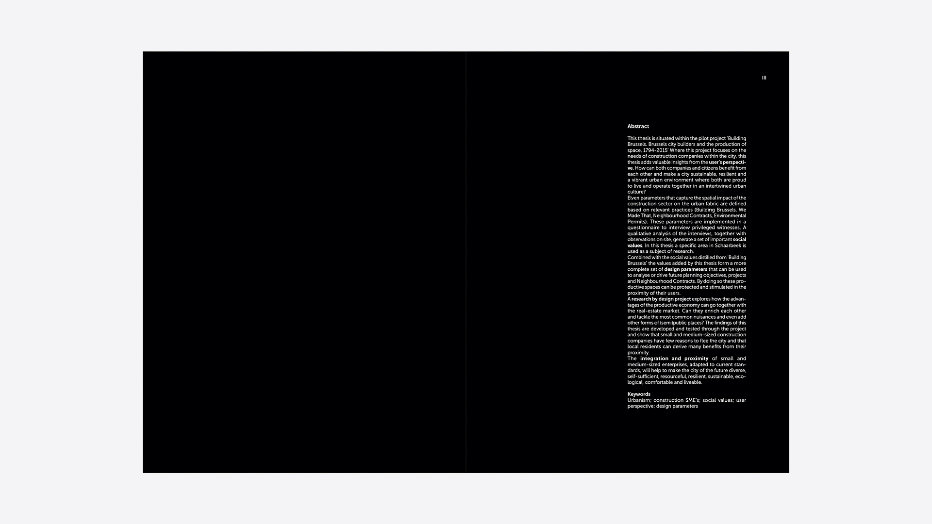
Io Hendrickx
Project
Book design
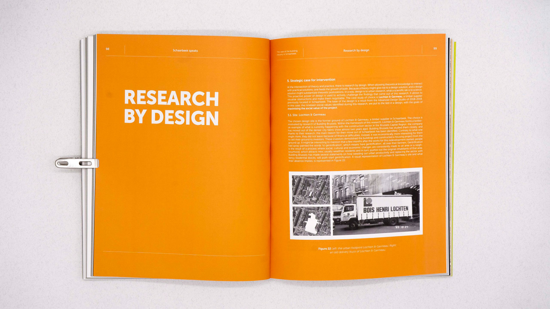
Schaarbeek speaks is a printed book about the added social
value of urban productive spaces in the Brussels Capital Region.
Printed on Biotop paper 120gr + 300gr for the cover.
Io Hendrickx
Project
Book design
Schaarbeek speaks is a printed book about the added social
value of urban productive spaces in the Brussels Capital Region.
Printed on Biotop paper 120gr + 300gr for the cover.


Client
Geomont
Project
Web design
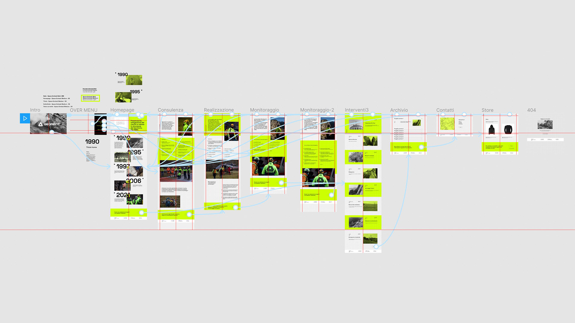
Geomont Srl is an Italian company, based in Lecco, engaged in prevention, risk mitigation and safety of the territory since 1990. Using mountaineering techniques and work at high altitudes, equipment specially designed for unfavorable situations and environments – even in the absence of scaffolding – with the helicopter, Geomont is able to face any intervention even in the logistically most anomalous and complicated situations. Based on the historical corporate colours, I designed the website starting from the concept of the wire mesh. Hence the idea of having all the textual and photographic contents supported by a graphical grid. The primary typeface used is Space Grotesk: sans-serif, optimized for better readability, gives the website a technical and geometric aspect, taking up the rigidity of the grid. As Geomont grew and evolved, so did their vision and how they want to be perceived. To help craft an online presence that could reflect those intentions I was invited to design a digital and responsive website.
Thanks to:
UI design: Arturo Colombo @artu.ro.col
Copywrite: Alessandro Vanossi @fluffypubes69
Photography: Andrea Lops @andrea.lops
Web developer: Odon Airoldi
Geomont
Project
Web design
Geomont Srl is an Italian company, based in Lecco, engaged in prevention, risk mitigation and safety of the territory since 1990. Using mountaineering techniques and work at high altitudes, equipment specially designed for unfavorable situations and environments – even in the absence of scaffolding – with the helicopter, Geomont is able to face any intervention even in the logistically most anomalous and complicated situations. Based on the historical corporate colours, I designed the website starting from the concept of the wire mesh. Hence the idea of having all the textual and photographic contents supported by a graphical grid. The primary typeface used is Space Grotesk: sans-serif, optimized for better readability, gives the website a technical and geometric aspect, taking up the rigidity of the grid. As Geomont grew and evolved, so did their vision and how they want to be perceived. To help craft an online presence that could reflect those intentions I was invited to design a digital and responsive website.
Thanks to:
UI design: Arturo Colombo @artu.ro.col
Copywrite: Alessandro Vanossi @fluffypubes69
Photography: Andrea Lops @andrea.lops
Web developer: Odon Airoldi


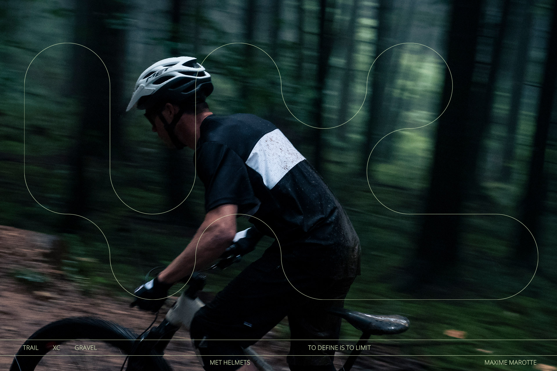
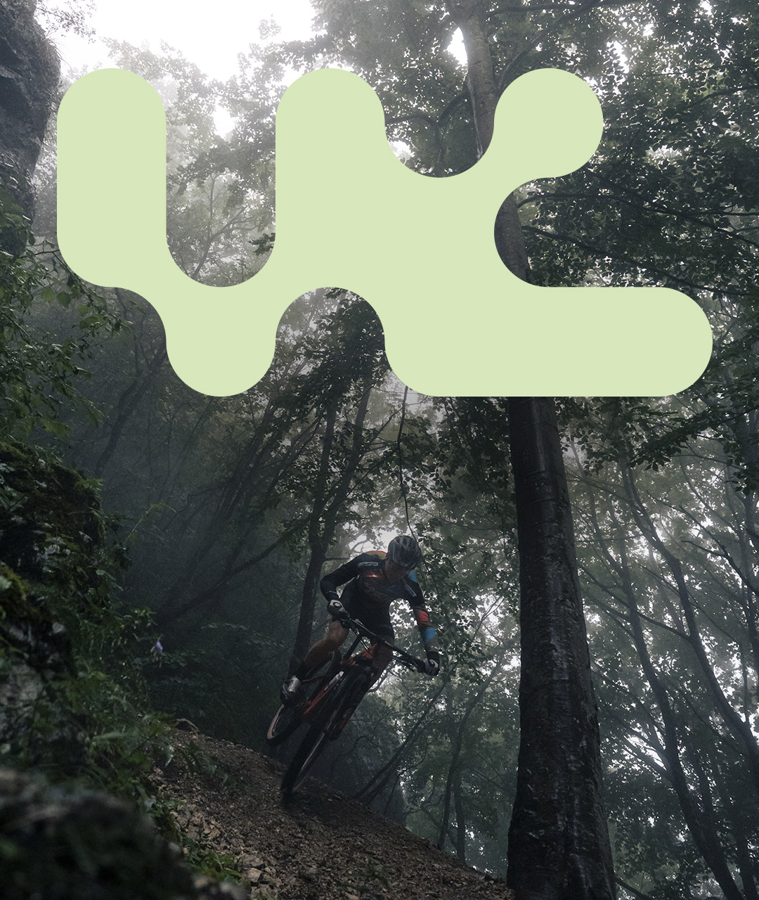
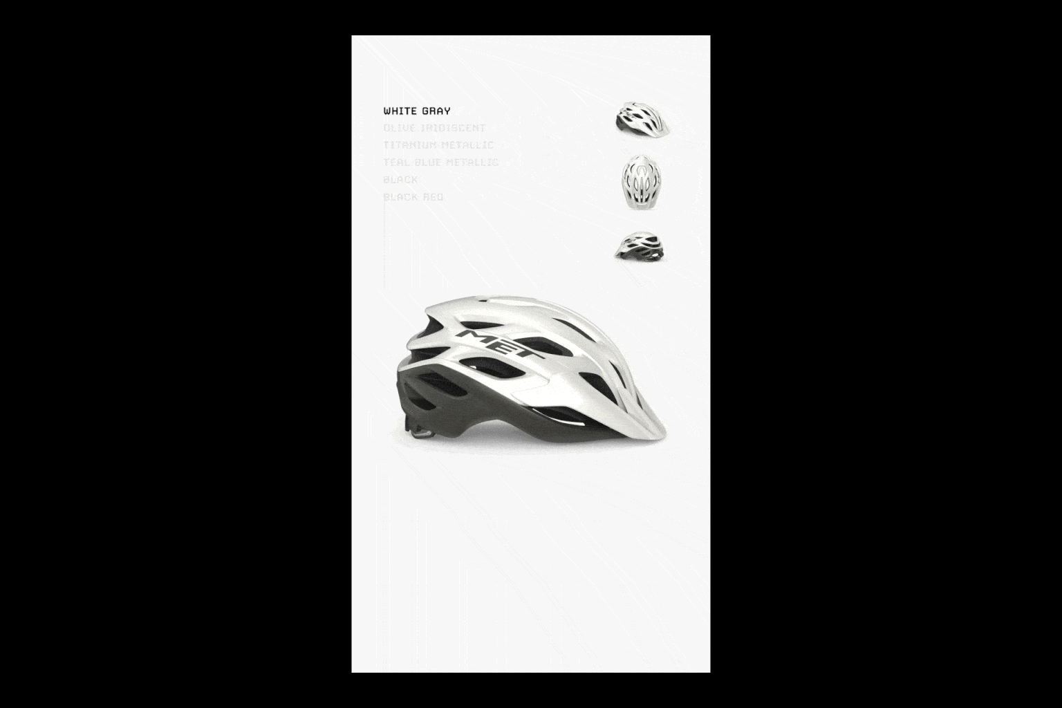
Client
MET Helmets
@met_helmets
Project
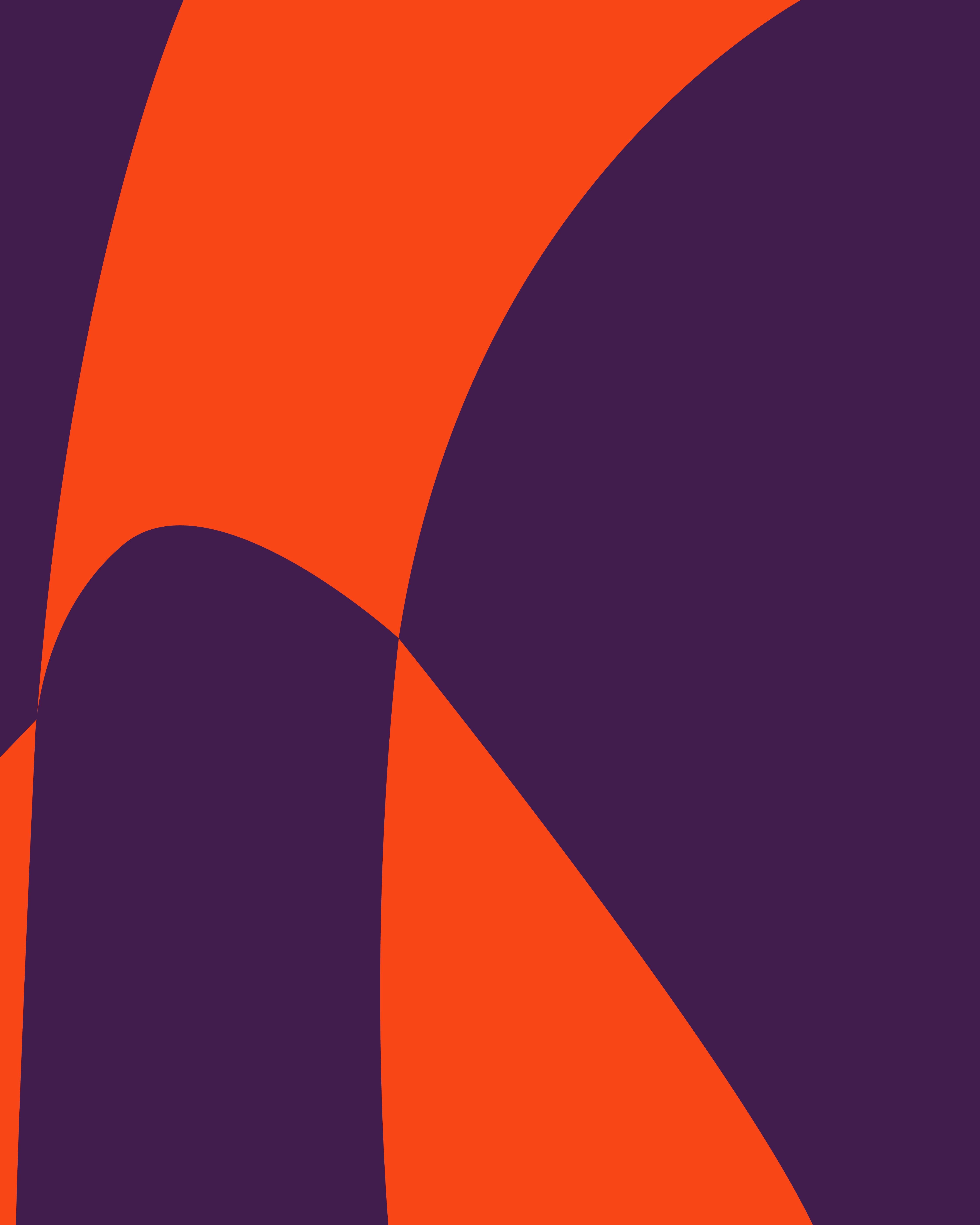
“Veleno” Brand identity & Campaign
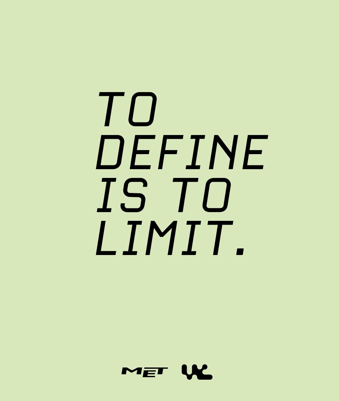
The all new Veleno Mips is made for any bike and none in particular. The most versatile helmet of the MET range, it gives you access to the entire world of cycling in one go thanks to its variety of features. Naturally born for MTB with a sporty design, it also adapts to tarmac and gravel roads. Secure and protective on the trail but light and ventilated for long bike packing rides on or off-road. Suiting all categories, the Veleno refuses them all, confirming that to define is to limit. Starting from the meaning of the name, the logo was designed with a fluid construction reminiscent of the liquid of poison. Then I designed the visual identity and the launch campaign.
Thanks to: MET Helmets team
MET Helmets
@met_helmets
Project
“Veleno” Brand identity & Campaign
The all new Veleno Mips is made for any bike and none in particular. The most versatile helmet of the MET range, it gives you access to the entire world of cycling in one go thanks to its variety of features. Naturally born for MTB with a sporty design, it also adapts to tarmac and gravel roads. Secure and protective on the trail but light and ventilated for long bike packing rides on or off-road. Suiting all categories, the Veleno refuses them all, confirming that to define is to limit. Starting from the meaning of the name, the logo was designed with a fluid construction reminiscent of the liquid of poison. Then I designed the visual identity and the launch campaign.
Thanks to: MET Helmets team
Motion graphic: Alessandro Maffioletti @alessandro_maffioletti
Photo courtesy: Ulysse Daessle @ulyssedaessle